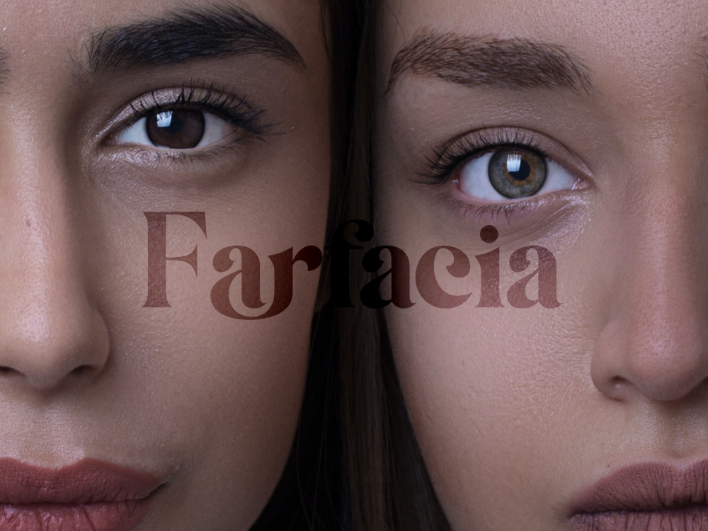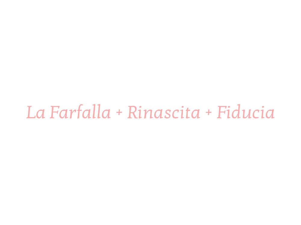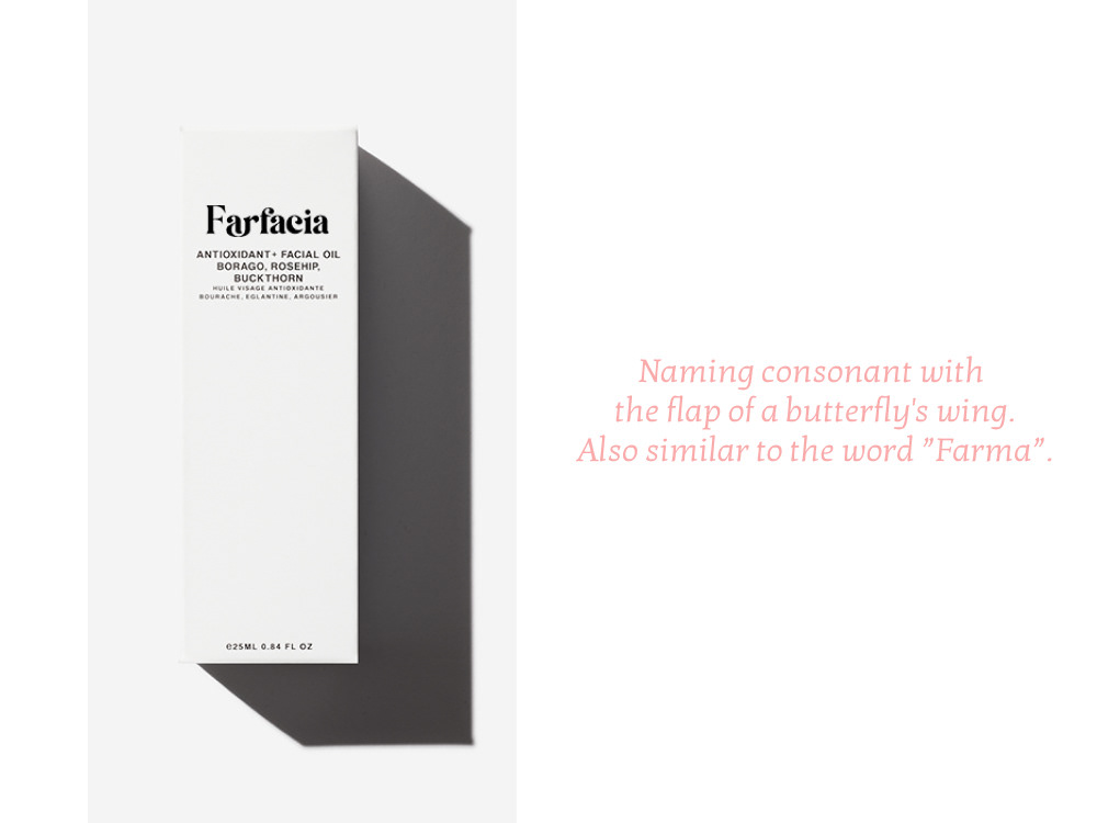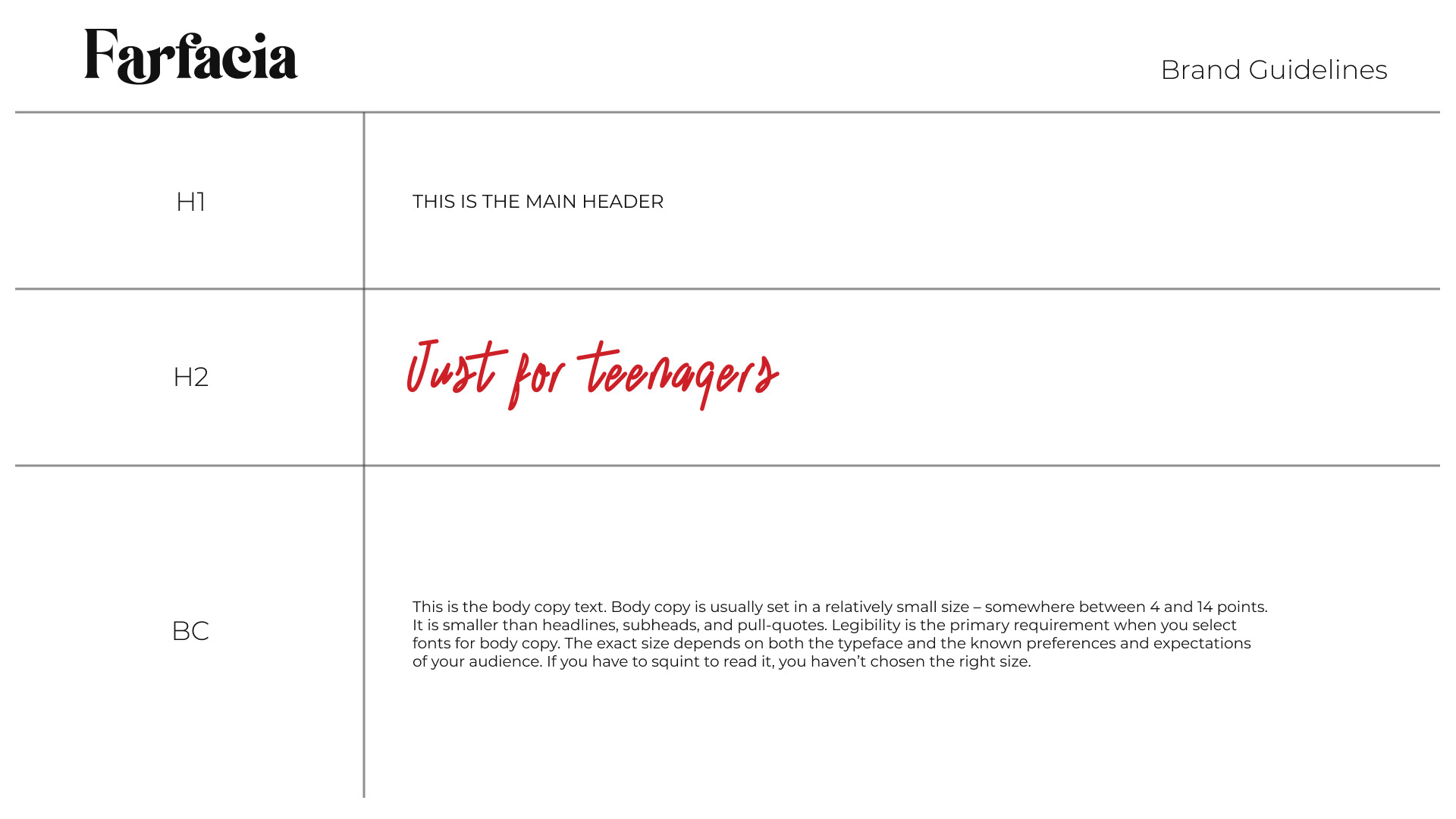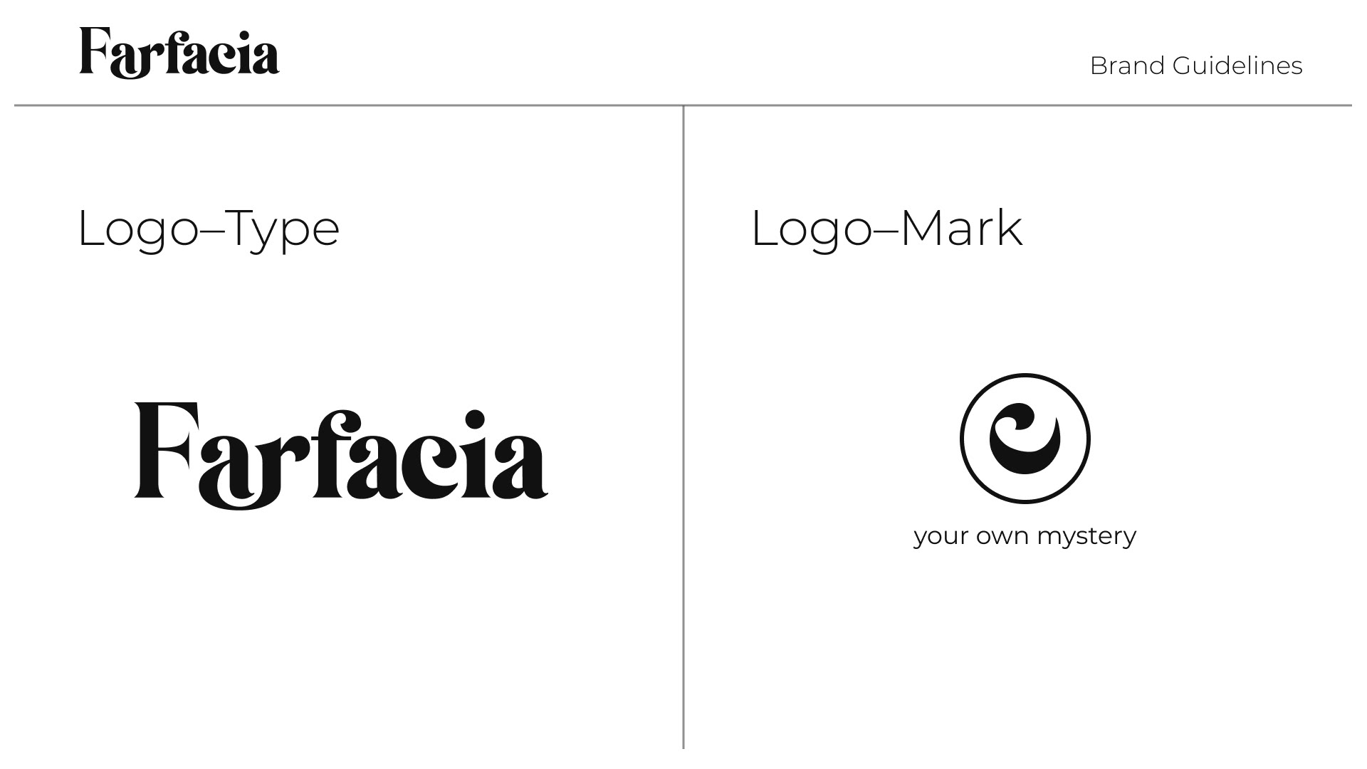
This project involved the creation of brand naming and design based on the words "butterfly," "trust," and "rebirth." The naming process aimed to capture the essence of these words and their symbolic meanings. The logo was designed to complement the brand naming, incorporating visual elements that resemble butterfly wings within the letterforms. Additionally, a logo mark was created based on the letter "c," representing a condensed representation of the brand identity.
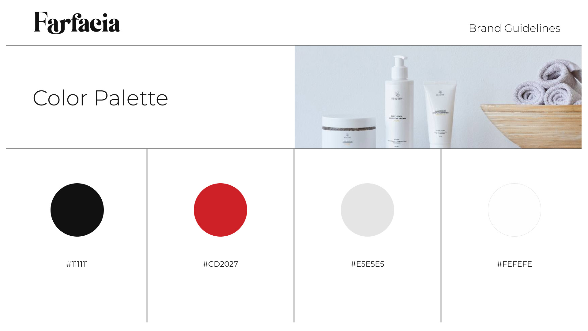
The design includes a carefully crafted color palette and font scheme that aligns with the brand's values and desired aesthetic. The colors chosen may evoke feelings of transformation, trust, and vibrancy, while the fonts selected enhance the overall visual identity and readability of the brand.
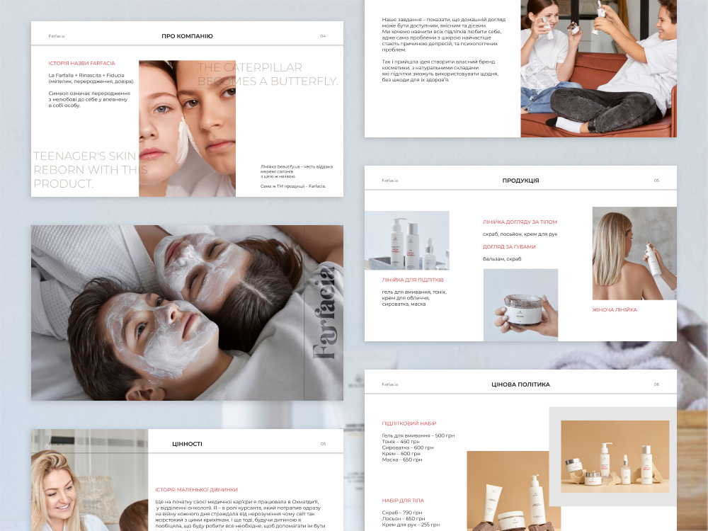
In addition to the logo and design elements, a comprehensive document was created for marketing presentations. This document serves as a guide for showcasing the brand's visual identity, providing consistency in messaging and design across various marketing materials.